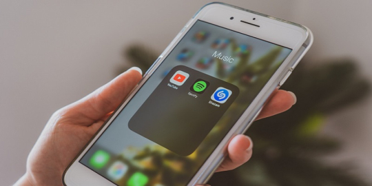
Android users are going to be the first to see the redesign of YouTube Music and many of its buttons. Special consideration has been given to Material You, which will allow many of the Google apps to have a common UI experience and shared design. Right now, YouTube Music is going through some design changes and is getting a visual update that will change the design of the buttons that correspond to Material You design principles.
Google has been fairly subtle about the new changes to the UI of YouTube Music on Android devices and hasn’t made any loud statements. Some of the buttons were simply altered, changing their shape and the way that they look. In particular, the shuffle button is no longer rectangular, but pill-shaped.
Additionally, mood filters located in the Home feed will now be displayed in a box with rounded corners. The “More” button was also reworked and now resides in its own button, instead of being a simple block of text. The newly redesigned version of the app is limited to a small number of users, but hopefully, that will change in the near future.
Have you seen the new button design for YouTube Music? Do you like the idea that all Google apps will have a similar design? Share your thoughts in the comment section below.
Leave a comment
Your comment is awaiting moderation. We save your draft here
0 Comments